---
title: Exploratory Data Analysis
date: 2024-10-19T16:53:34Z
modified: 2026-07-04T08:44:09Z
permalink: "https://www.micheledpierri.com/data-analysis/exploratory-data-analysis/"
type: page
status: publish
excerpt: ""
wpid: 660
featured_image: "https://www.micheledpierri.com/wp-content/uploads/2026/07/d_a_exploratory_.png"
featured_image_alt: A bearded captain scans a stormy sea through a spyglass as glowing numbers drift among the clouds above the crashing waves.
timestamp: 2026-07-04T08:44:09Z
tags: []
---

Exploratory Data Analysis (EDA) is an approach to data analysis that involves examining data to identify its main characteristics, recognize patterns, and potentially uncover anomalies and hidden structures. This method allows researchers to gain insights before formulating specific hypotheses.

The knowledge gained during EDA is then used to construct statistical hypotheses and proceed with formal inferential statistical analysis. This process helps researchers develop a more informed and data-driven study approach.

Introduced in the 1970s, EDA differs from traditional statistical research methods in its approach to data. While traditional methods often start with predefined hypotheses, EDA explores data holistically to generate hypotheses. This exploratory approach allows a more flexible and comprehensive understanding of the dataset before moving on to more formal statistical tests.

EDA is crucial in Machine Learning workflows. Before training a model, it’s essential to explore the data to identify relevant variables, determine which need transformation, and assess how to balance the dataset. A well-executed EDA can significantly enhance the quality and effectiveness of predictive models.

EDA employs various techniques that should be viewed as both sequential and circular. After performing an initial analysis, researchers can restart the process, leveraging insights and modifications gained from the previous analysis. This iterative approach allows for a more comprehensive exploration of the data.

The typical steps of an EDA include:

- Data cleaning: Removing anomalous or incorrect data, handling outliers, and managing missing values. Most of these cleaning procedures have been discussed previously.
- Data transformation: Applying standardization operations and logarithmic transformations where necessary.
- Dimensionality reduction: Simplifying complex datasets through data reduction techniques when needed.
- Data analysis: Examining data both individually and in groups (bivariate for comparing variables in pairs, or multivariate for comparing variables in groups). This phase employs descriptive statistics techniques such as mean, median, mode, standard deviation, variance, quartiles, percentiles, correlations, and covariances.
- Graphical analysis: A crucial EDA process involving the creation of suitable graphs for data visualization. Patterns or anomalies often emerge more clearly from these visual representations than from numerical characteristics. Visualization methods include histograms, box plots, scatter plots, correlation matrices, heatmaps, density plots, and pair plots.
- Application of advanced techniques: These include Principal Component Analysis (PCA)—a dimensional reduction technique that identifies the main directions of data variability; clustering—a method for grouping data into homogeneous clusters based on similarities; and other techniques such as t-SNE and UMAP.

---

![Iris flower](https://www.micheledpierri.com/wp-content/uploads/2024/10/Iris_07_-_Arlington_MA-1024x1024.jpg)

Next, we will explore all the exploratory data analysis processes by conducting a complete EDA using Python. We’ll use the Iris dataset as our example, which contains measurements of flowers from three different species: _Setosa_, _Versicolor_, and _Virginica_. Each flower is characterized by four numerical features: the length and width of its sepals and petals.

Let’s load the necessary libraries

import pandas as pd
import seaborn as sns
import matplotlib.pyplot as plt
```
<span class="line"><span style="color: #FF79C6">import</span><span style="color: #F8F8F2"> pandas </span><span style="color: #FF79C6">as</span><span style="color: #F8F8F2"> pd</span></span>
<span class="line"><span style="color: #FF79C6">import</span><span style="color: #F8F8F2"> seaborn </span><span style="color: #FF79C6">as</span><span style="color: #F8F8F2"> sns</span></span>
<span class="line"><span style="color: #FF79C6">import</span><span style="color: #F8F8F2"> matplotlib.pyplot </span><span style="color: #FF79C6">as</span><span style="color: #F8F8F2"> plt</span></span>
<span class="line"></span>
```

Let’s load the “Iris” dataset directly from the internet

url = "<https://raw.githubusercontent.com/mwaskom/seaborn-data/master/iris.csv>"
df = pd.read_csv(url)
df.head()
```
<span class="line"><span style="color: #F8F8F2">url </span><span style="color: #FF79C6">=</span><span style="color: #F8F8F2"> </span><span style="color: #E9F284">"</span><span style="color: #F1FA8C"><https://raw.githubusercontent.com/mwaskom/seaborn-data/master/iris.csv></span><span style="color: #E9F284">"</span></span>
<span class="line"><span style="color: #F8F8F2">df </span><span style="color: #FF79C6">=</span><span style="color: #F8F8F2"> pd.read_csv(url)</span></span>
<span class="line"><span style="color: #F8F8F2">df.head()</span></span>
<span class="line"></span>
```

Let’s explore the dimensions of the dataset

ds.shape
```
<span class="line"><span style="color: #F8F8F2">ds.shape</span></span>
<span class="line"></span>
```

The dataset comprises 150 observations (samples or rows) and 5 variables (columns).

Let’s analyze the numerical variables:

ds.describe()
```
<span class="line"><span style="color: #F8F8F2">ds.describe()</span></span>
<span class="line"></span>
```

From the statistical summary, we can observe the following for each of the numerical variables:

- **Sepal Length**: the average length is 5.84 cm, with a range from 4.3 cm to 7.9 cm.
- **Sepal Width**: average width of 3.05 cm, with a range from 2.0 cm to 4.4 cm.
- **Petal Length**: the average petal length is 3.76 cm, with a range varying between 1.0 cm and 6.9 cm.
- **Petal Width**: the average width is 1.20 cm, with a minimum of 0.1 cm and a maximum of 2.5 cm.

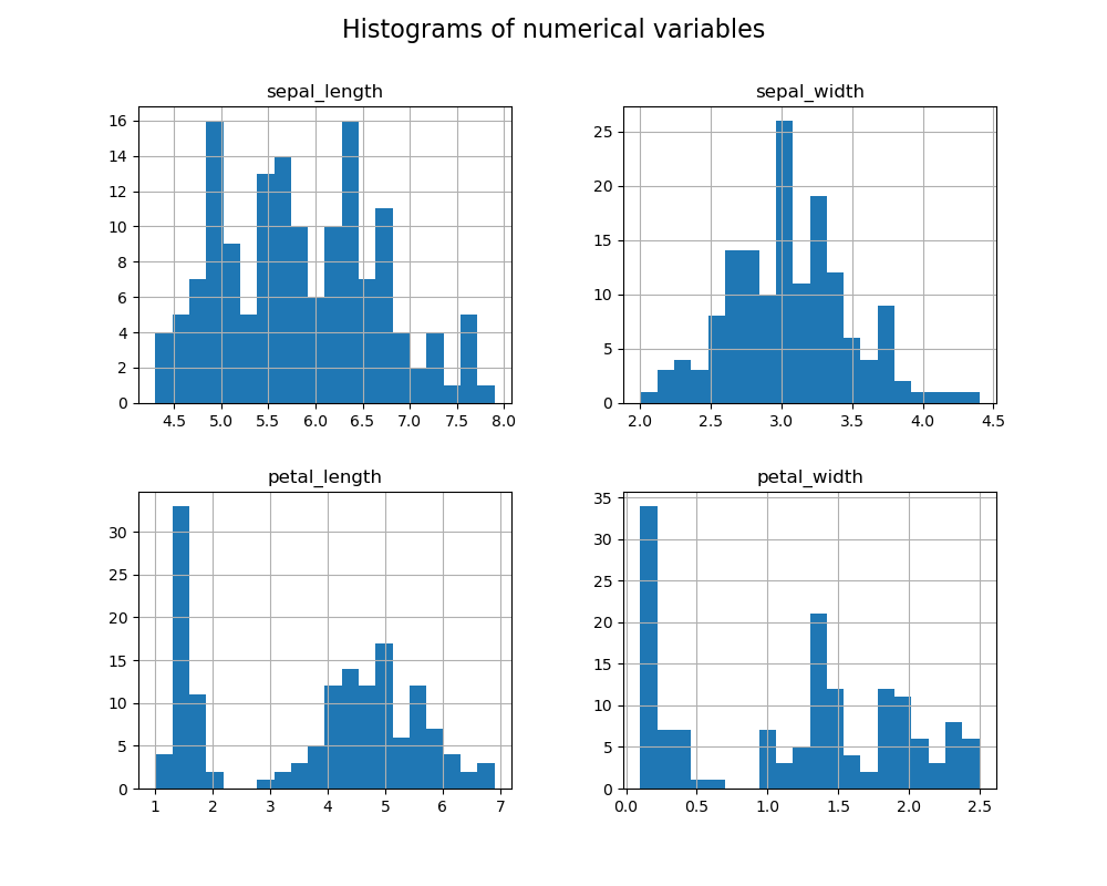
Let’s visualize the distribution of values with histograms:

df.hist(figsize=(10, 8), bins=20)
plt.suptitle('Histograms of numerical variables', fontsize=16)
plt.show()
```
<span class="line"><span style="color: #F8F8F2">df.hist(</span><span style="color: #FFB86C; font-style: italic">figsize</span><span style="color: #FF79C6">=</span><span style="color: #F8F8F2">(</span><span style="color: #BD93F9">10</span><span style="color: #F8F8F2">, </span><span style="color: #BD93F9">8</span><span style="color: #F8F8F2">), </span><span style="color: #FFB86C; font-style: italic">bins</span><span style="color: #FF79C6">=</span><span style="color: #BD93F9">20</span><span style="color: #F8F8F2">)</span></span>
<span class="line"><span style="color: #F8F8F2">plt.suptitle(</span><span style="color: #E9F284">'</span><span style="color: #F1FA8C">Histograms of numerical variables</span><span style="color: #E9F284">'</span><span style="color: #F8F8F2">, </span><span style="color: #FFB86C; font-style: italic">fontsize</span><span style="color: #FF79C6">=</span><span style="color: #BD93F9">16</span><span style="color: #F8F8F2">)</span></span>
<span class="line"><span style="color: #F8F8F2">plt.show()</span></span>
<span class="line"></span>
```

![histogram of numerical varibles of the iris dataset](https://www.micheledpierri.com/wp-content/uploads/2024/10/eda-4.png)

The histograms show the distribution of each numerical variable:

- **Sepal Length** and **Petal Length** appear to have similar distributions, with a peak in the central part, but with asymmetric tails towards higher values.
- **Sepal Width** shows a more uniform distribution, with a slight concentration of values around 3.0 cm.
- **Petal Width** exhibits a bimodal distribution, suggesting possible differences between species.

Relationships between variables

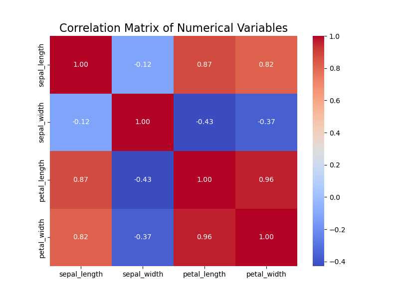
To analyze the relationship between variables, we use a scatter plot and a correlation matrix:

correlation_matrix = df.corr(numeric_only=True)

plt.figure(figsize=(8, 6))
sns.heatmap(correlation_matrix, annot=True, cmap='coolwarm', fmt=".2f")
plt.title('Correlation Matrix of Numerical Variables', fontsize=16)
plt.show()
```
<span class="line"><span style="color: #F8F8F2">correlation_matrix </span><span style="color: #FF79C6">=</span><span style="color: #F8F8F2"> df.corr(</span><span style="color: #FFB86C; font-style: italic">numeric_only</span><span style="color: #FF79C6">=</span><span style="color: #BD93F9">True</span><span style="color: #F8F8F2">)</span></span>
<span class="line"></span>
<span class="line"><span style="color: #F8F8F2">plt.figure(</span><span style="color: #FFB86C; font-style: italic">figsize</span><span style="color: #FF79C6">=</span><span style="color: #F8F8F2">(</span><span style="color: #BD93F9">8</span><span style="color: #F8F8F2">, </span><span style="color: #BD93F9">6</span><span style="color: #F8F8F2">))</span></span>
<span class="line"><span style="color: #F8F8F2">sns.heatmap(correlation_matrix, </span><span style="color: #FFB86C; font-style: italic">annot</span><span style="color: #FF79C6">=</span><span style="color: #BD93F9">True</span><span style="color: #F8F8F2">, </span><span style="color: #FFB86C; font-style: italic">cmap</span><span style="color: #FF79C6">=</span><span style="color: #E9F284">'</span><span style="color: #F1FA8C">coolwarm</span><span style="color: #E9F284">'</span><span style="color: #F8F8F2">, </span><span style="color: #FFB86C; font-style: italic">fmt</span><span style="color: #FF79C6">=</span><span style="color: #E9F284">"</span><span style="color: #F1FA8C">.2f</span><span style="color: #E9F284">"</span><span style="color: #F8F8F2">)</span></span>
<span class="line"><span style="color: #F8F8F2">plt.title(</span><span style="color: #E9F284">'</span><span style="color: #F1FA8C">Correlation Matrix of Numerical Variables</span><span style="color: #E9F284">'</span><span style="color: #F8F8F2">, </span><span style="color: #FFB86C; font-style: italic">fontsize</span><span style="color: #FF79C6">=</span><span style="color: #BD93F9">16</span><span style="color: #F8F8F2">)</span></span>
<span class="line"><span style="color: #F8F8F2">plt.show()</span></span>
<span class="line"></span>
```

![Correlation matrix of variables](https://www.micheledpierri.com/wp-content/uploads/2024/10/eda-1.png)

The correlation matrix shows the following observations:

- **Petal Length** and **Petal Width** have a strong positive correlation (0.96), suggesting that these two variables tend to increase together.
- **Sepal Length** has a moderate correlation with **Petal Length** (0.87) and **Petal Width** (0.82).
- **Sepal Width** has weaker correlations compared to the other variables.

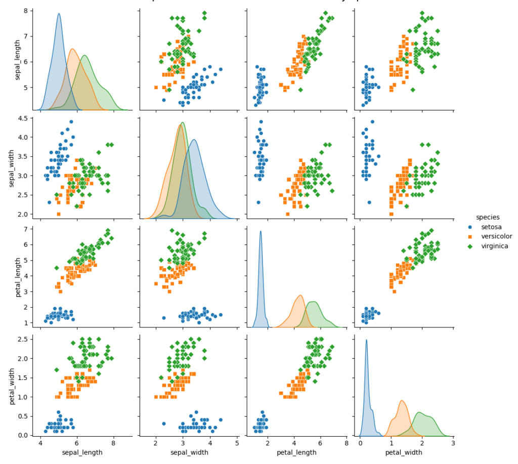
Now let’s consider our discrete variable containing the species labels. We’ll examine how the various numerical variables relating to petal and sepal dimensions correlate with the species.

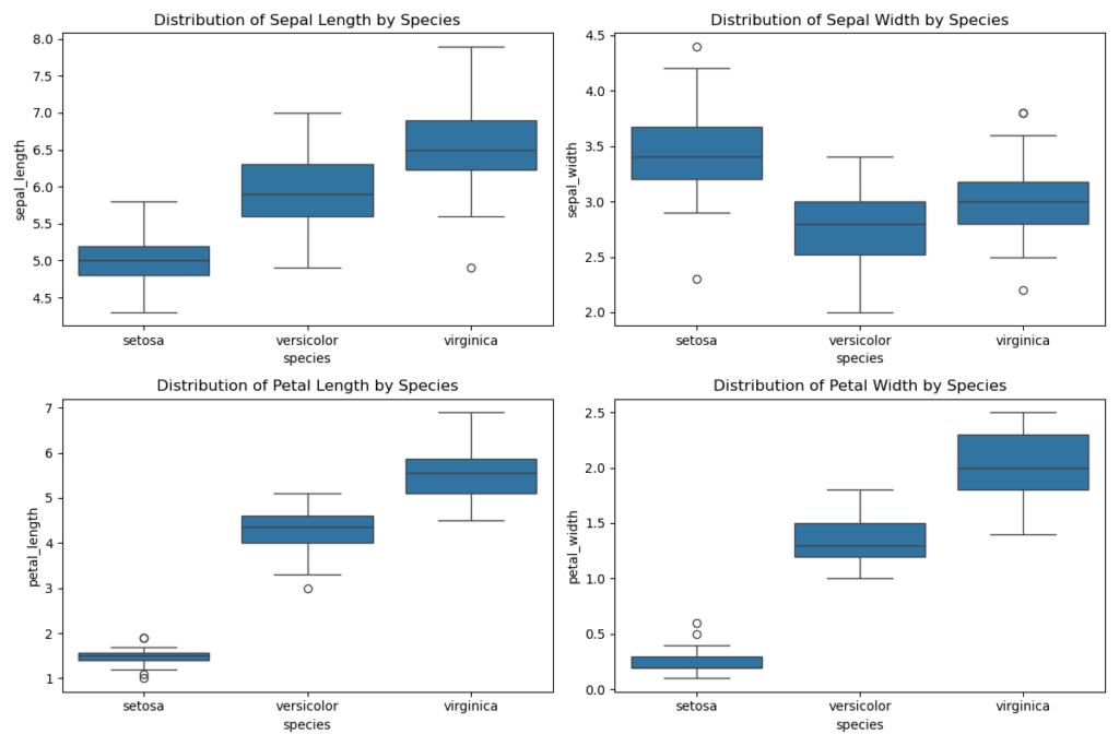
To perform this graphical comparison, we’ll use both a pair plot and box plots, giving us a comprehensive view of the relationships.

First, let’s create a pair plot to compare numerical variables across species:

sns.pairplot(df, hue='species', diag_kind='kde', markers=["o", "s", "D"])
plt.suptitle('Pair plot of numerical variables colored by species', y=1.02, fontsize=16)
plt.show()
```
<span class="line"><span style="color: #F8F8F2">sns.pairplot(df, </span><span style="color: #FFB86C; font-style: italic">hue</span><span style="color: #FF79C6">=</span><span style="color: #E9F284">'</span><span style="color: #F1FA8C">species</span><span style="color: #E9F284">'</span><span style="color: #F8F8F2">, </span><span style="color: #FFB86C; font-style: italic">diag_kind</span><span style="color: #FF79C6">=</span><span style="color: #E9F284">'</span><span style="color: #F1FA8C">kde</span><span style="color: #E9F284">'</span><span style="color: #F8F8F2">, </span><span style="color: #FFB86C; font-style: italic">markers</span><span style="color: #FF79C6">=</span><span style="color: #F8F8F2">[</span><span style="color: #E9F284">"</span><span style="color: #F1FA8C">o</span><span style="color: #E9F284">"</span><span style="color: #F8F8F2">, </span><span style="color: #E9F284">"</span><span style="color: #F1FA8C">s</span><span style="color: #E9F284">"</span><span style="color: #F8F8F2">, </span><span style="color: #E9F284">"</span><span style="color: #F1FA8C">D</span><span style="color: #E9F284">"</span><span style="color: #F8F8F2">])</span></span>
<span class="line"><span style="color: #F8F8F2">plt.suptitle(</span><span style="color: #E9F284">'</span><span style="color: #F1FA8C">Pair plot of numerical variables colored by species</span><span style="color: #E9F284">'</span><span style="color: #F8F8F2">, </span><span style="color: #FFB86C; font-style: italic">y</span><span style="color: #FF79C6">=</span><span style="color: #BD93F9">1.02</span><span style="color: #F8F8F2">, </span><span style="color: #FFB86C; font-style: italic">fontsize</span><span style="color: #FF79C6">=</span><span style="color: #BD93F9">16</span><span style="color: #F8F8F2">)</span></span>
<span class="line"><span style="color: #F8F8F2">plt.show()</span></span>
<span class="line"></span>
```

![Pairplot](https://www.micheledpierri.com/wp-content/uploads/2024/10/eda-2-1024x917.png)

Now let’s use box plots for the same graphical analysis:

# Box plot to visualize the distribution of variables for each species
plt.figure(figsize=(12, 8))

# Box plot for Sepal Length
plt.subplot(2, 2, 1)
sns.boxplot(x='species', y='sepal_length', data=df)
plt.title('Distribution of Sepal Length by Species')

# Box plot for Sepal Width
plt.subplot(2, 2, 2)
sns.boxplot(x='species', y='sepal_width', data=df)
plt.title('Distribution of Sepal Width by Species')

# Box plot for Petal Length
plt.subplot(2, 2, 3)
sns.boxplot(x='species', y='petal_length', data=df)
plt.title('Distribution of Petal Length by Species')

# Box plot for Petal Width
plt.subplot(2, 2, 4)
sns.boxplot(x='species', y='petal_width', data=df)
plt.title('Distribution of Petal Width by Species')

plt.tight_layout()
plt.show()
```
<span class="line"><span style="color: #6272A4"># Box plot to visualize the distribution of variables for each species</span></span>
<span class="line"><span style="color: #F8F8F2">plt.figure(</span><span style="color: #FFB86C; font-style: italic">figsize</span><span style="color: #FF79C6">=</span><span style="color: #F8F8F2">(</span><span style="color: #BD93F9">12</span><span style="color: #F8F8F2">, </span><span style="color: #BD93F9">8</span><span style="color: #F8F8F2">))</span></span>
<span class="line"></span>
<span class="line"><span style="color: #6272A4"># Box plot for Sepal Length</span></span>
<span class="line"><span style="color: #F8F8F2">plt.subplot(</span><span style="color: #BD93F9">2</span><span style="color: #F8F8F2">, </span><span style="color: #BD93F9">2</span><span style="color: #F8F8F2">, </span><span style="color: #BD93F9">1</span><span style="color: #F8F8F2">)</span></span>
<span class="line"><span style="color: #F8F8F2">sns.boxplot(</span><span style="color: #FFB86C; font-style: italic">x</span><span style="color: #FF79C6">=</span><span style="color: #E9F284">'</span><span style="color: #F1FA8C">species</span><span style="color: #E9F284">'</span><span style="color: #F8F8F2">, </span><span style="color: #FFB86C; font-style: italic">y</span><span style="color: #FF79C6">=</span><span style="color: #E9F284">'</span><span style="color: #F1FA8C">sepal_length</span><span style="color: #E9F284">'</span><span style="color: #F8F8F2">, </span><span style="color: #FFB86C; font-style: italic">data</span><span style="color: #FF79C6">=</span><span style="color: #F8F8F2">df)</span></span>
<span class="line"><span style="color: #F8F8F2">plt.title(</span><span style="color: #E9F284">'</span><span style="color: #F1FA8C">Distribution of Sepal Length by Species</span><span style="color: #E9F284">'</span><span style="color: #F8F8F2">)</span></span>
<span class="line"></span>
<span class="line"><span style="color: #6272A4"># Box plot for Sepal Width</span></span>
<span class="line"><span style="color: #F8F8F2">plt.subplot(</span><span style="color: #BD93F9">2</span><span style="color: #F8F8F2">, </span><span style="color: #BD93F9">2</span><span style="color: #F8F8F2">, </span><span style="color: #BD93F9">2</span><span style="color: #F8F8F2">)</span></span>
<span class="line"><span style="color: #F8F8F2">sns.boxplot(</span><span style="color: #FFB86C; font-style: italic">x</span><span style="color: #FF79C6">=</span><span style="color: #E9F284">'</span><span style="color: #F1FA8C">species</span><span style="color: #E9F284">'</span><span style="color: #F8F8F2">, </span><span style="color: #FFB86C; font-style: italic">y</span><span style="color: #FF79C6">=</span><span style="color: #E9F284">'</span><span style="color: #F1FA8C">sepal_width</span><span style="color: #E9F284">'</span><span style="color: #F8F8F2">, </span><span style="color: #FFB86C; font-style: italic">data</span><span style="color: #FF79C6">=</span><span style="color: #F8F8F2">df)</span></span>
<span class="line"><span style="color: #F8F8F2">plt.title(</span><span style="color: #E9F284">'</span><span style="color: #F1FA8C">Distribution of Sepal Width by Species</span><span style="color: #E9F284">'</span><span style="color: #F8F8F2">)</span></span>
<span class="line"></span>
<span class="line"><span style="color: #6272A4"># Box plot for Petal Length</span></span>
<span class="line"><span style="color: #F8F8F2">plt.subplot(</span><span style="color: #BD93F9">2</span><span style="color: #F8F8F2">, </span><span style="color: #BD93F9">2</span><span style="color: #F8F8F2">, </span><span style="color: #BD93F9">3</span><span style="color: #F8F8F2">)</span></span>
<span class="line"><span style="color: #F8F8F2">sns.boxplot(</span><span style="color: #FFB86C; font-style: italic">x</span><span style="color: #FF79C6">=</span><span style="color: #E9F284">'</span><span style="color: #F1FA8C">species</span><span style="color: #E9F284">'</span><span style="color: #F8F8F2">, </span><span style="color: #FFB86C; font-style: italic">y</span><span style="color: #FF79C6">=</span><span style="color: #E9F284">'</span><span style="color: #F1FA8C">petal_length</span><span style="color: #E9F284">'</span><span style="color: #F8F8F2">, </span><span style="color: #FFB86C; font-style: italic">data</span><span style="color: #FF79C6">=</span><span style="color: #F8F8F2">df)</span></span>
<span class="line"><span style="color: #F8F8F2">plt.title(</span><span style="color: #E9F284">'</span><span style="color: #F1FA8C">Distribution of Petal Length by Species</span><span style="color: #E9F284">'</span><span style="color: #F8F8F2">)</span></span>
<span class="line"></span>
<span class="line"><span style="color: #6272A4"># Box plot for Petal Width</span></span>
<span class="line"><span style="color: #F8F8F2">plt.subplot(</span><span style="color: #BD93F9">2</span><span style="color: #F8F8F2">, </span><span style="color: #BD93F9">2</span><span style="color: #F8F8F2">, </span><span style="color: #BD93F9">4</span><span style="color: #F8F8F2">)</span></span>
<span class="line"><span style="color: #F8F8F2">sns.boxplot(</span><span style="color: #FFB86C; font-style: italic">x</span><span style="color: #FF79C6">=</span><span style="color: #E9F284">'</span><span style="color: #F1FA8C">species</span><span style="color: #E9F284">'</span><span style="color: #F8F8F2">, </span><span style="color: #FFB86C; font-style: italic">y</span><span style="color: #FF79C6">=</span><span style="color: #E9F284">'</span><span style="color: #F1FA8C">petal_width</span><span style="color: #E9F284">'</span><span style="color: #F8F8F2">, </span><span style="color: #FFB86C; font-style: italic">data</span><span style="color: #FF79C6">=</span><span style="color: #F8F8F2">df)</span></span>
<span class="line"><span style="color: #F8F8F2">plt.title(</span><span style="color: #E9F284">'</span><span style="color: #F1FA8C">Distribution of Petal Width by Species</span><span style="color: #E9F284">'</span><span style="color: #F8F8F2">)</span></span>
<span class="line"></span>
<span class="line"><span style="color: #F8F8F2">plt.tight_layout()</span></span>
<span class="line"><span style="color: #F8F8F2">plt.show()</span></span>
<span class="line"></span>
```

![Boxplot of variables in the iris dataset](https://www.micheledpierri.com/wp-content/uploads/2024/10/eda-3-1024x683.png)

The pair plots and box plots clearly illustrate the differences in measurements among the species:

- **Sepal Length and Sepal Width**: _Setosa_ typically has smaller sepal dimensions than _Versicolor_ and _Virginica_. _Virginica_ generally exhibits the highest values for Sepal Length.
- **Petal Length and Petal Width**: These characteristics show more pronounced differences. _Setosa_ has significantly smaller petals than the other two species, while _Virginica_ boasts the largest petals in both dimensions.

These findings highlight that petal-related variables are particularly effective for species differentiation, potentially enhancing the accuracy of classification models.

Our EDA is now complete.

Based on our observations, we can move forward with data analysis, hypothesis testing, and applying appropriate statistical models to validate our EDA findings. Statistical techniques like ANOVA, t-tests, and logistic regression, along with machine learning methods such as LDA, offer robust tools for confirming species differences and constructing accurate predictive models. These formal approaches enable us to transform EDA-derived insights into solid, verifiable statistical conclusions.

Let’s apply one-way ANOVA by formulating the following hypotheses:

- H₀: There are no differences in dimensions between the species
- H₁: There are differences in dimensions between the species

If the one-way ANOVA yields significant results, we’ll need to conduct a post-hoc test to identify which pairs of species differ. For this, we’ll employ Tukey’s Honest Significant Difference test.

import scipy.stats as stats
import statsmodels.api as sm
from statsmodels.formula.api import ols

model = ols('petal_length ~ species', data=df).fit()
anova_table = sm.stats.anova_lm(model, typ=2)
print(anova_table)
```
<span class="line"><span style="color: #FF79C6">import</span><span style="color: #F8F8F2"> scipy.stats </span><span style="color: #FF79C6">as</span><span style="color: #F8F8F2"> stats</span></span>
<span class="line"><span style="color: #FF79C6">import</span><span style="color: #F8F8F2"> statsmodels.api </span><span style="color: #FF79C6">as</span><span style="color: #F8F8F2"> sm</span></span>
<span class="line"><span style="color: #FF79C6">from</span><span style="color: #F8F8F2"> statsmodels.formula.api </span><span style="color: #FF79C6">import</span><span style="color: #F8F8F2"> ols</span></span>
<span class="line"></span>
<span class="line"><span style="color: #F8F8F2">model </span><span style="color: #FF79C6">=</span><span style="color: #F8F8F2"> ols(</span><span style="color: #E9F284">'</span><span style="color: #F1FA8C">petal_length ~ species</span><span style="color: #E9F284">'</span><span style="color: #F8F8F2">, </span><span style="color: #FFB86C; font-style: italic">data</span><span style="color: #FF79C6">=</span><span style="color: #F8F8F2">df).fit()</span></span>
<span class="line"><span style="color: #F8F8F2">anova_table </span><span style="color: #FF79C6">=</span><span style="color: #F8F8F2"> sm.stats.anova_lm(model, </span><span style="color: #FFB86C; font-style: italic">typ</span><span style="color: #FF79C6">=</span><span style="color: #BD93F9">2</span><span style="color: #F8F8F2">)</span></span>
<span class="line"><span style="color: #8BE9FD">print</span><span style="color: #F8F8F2">(anova_table)</span></span>
<span class="line"></span>
```

The ANOVA analysis of petal length across the three Iris species yields the following results:

- **Sum of Squares (sum\_sq)**: Between-species sum of squares is 437.10, while the within-species (residual) sum of squares is 27.22.
- **Degrees of Freedom (df)**: Between-species df is 2 (for three species), and residual df is 147.
- **F-value (F)**: The remarkably high F-value of **1180.16** indicates that the model-explained variance far exceeds the residual variance.
- **p-value (PR(>F))**: The ANOVA test’s p-value of **2.85e-91** (substantially below 0.05) suggests significant differences in petal length between at least two species.

Now let’s perform the Tukey’s HSD post hoc test:


import statsmodels.stats.multicomp as mc

# Tukey's post-hoc test for petal length
comp = mc.MultiComparison(df['petal_length'], df['species'])
tukey_result = comp.tukeyhsd()

# Display the results of Tukey's test
tukey_result.summary()
```
<span class="line"></span>
<span class="line"><span style="color: #FF79C6">import</span><span style="color: #F8F8F2"> statsmodels.stats.multicomp </span><span style="color: #FF79C6">as</span><span style="color: #F8F8F2"> mc</span></span>
<span class="line"></span>
<span class="line"><span style="color: #6272A4"># Tukey's post-hoc test for petal length</span></span>
<span class="line"><span style="color: #F8F8F2">comp </span><span style="color: #FF79C6">=</span><span style="color: #F8F8F2"> mc.MultiComparison(df[</span><span style="color: #E9F284">'</span><span style="color: #F1FA8C">petal_length</span><span style="color: #E9F284">'</span><span style="color: #F8F8F2">], df[</span><span style="color: #E9F284">'</span><span style="color: #F1FA8C">species</span><span style="color: #E9F284">'</span><span style="color: #F8F8F2">])</span></span>
<span class="line"><span style="color: #F8F8F2">tukey_result </span><span style="color: #FF79C6">=</span><span style="color: #F8F8F2"> comp.tukeyhsd()</span></span>
<span class="line"></span>
<span class="line"><span style="color: #6272A4"># Display the results of Tukey's test</span></span>
<span class="line"><span style="color: #F8F8F2">tukey_result.summary()</span></span>
<span class="line"></span>
```

The Tukey’s HSD test yields the following results:


| Group1 | Group2 | Mean Diff | p-adj | Lower | Upper | Reject |
| --- | --- | --- | --- | --- | --- | --- |
| setosa | versicolor | -2.798 | 0.001 | -3.014 | -2.581 | True |
| setosa | virginica | -4.084 | 0.001 | -4.300 | -3.868 | True |
| versicolor | virginica | -1.286 | 0.001 | -1.502 | -1.069 | True |

- **Mean Diff**: The average differences in petal lengths between the compared species.
- **p-adj**: The p-value adjusted for Tukey’s correction. In all comparisons, the p-value is **far below 0.05**, indicating statistically significant differences between species.
- **Lower and Upper**: The confidence interval’s lower and upper bounds for the mean difference.
- **Reject**: A “True” value in this column signifies rejection of the null hypothesis (no differences between groups).

The results confirm that all three Iris species—_setosa_, _versicolor_, and _virginica_—differ significantly from one another in terms of **petal length**. This finding underscores the value of petal length as a key variable for distinguishing between species in the Iris dataset.