
Definition
Sensitivity analysis is a collection of techniques that determine how input parameters affect model results. Specifically, it measures how much variation in the results stems from different types of uncertainty.
For a model:
$Y=f(X_1,X_2,X_3…..X_n)$
examines how Y changes when each X is modified.
Sensitivity analysis can be applied across several key areas: predictive models, simulation, risk assessment, complex systems optimization, model validation.
Through sensitivity analysis, we can evaluate how variables affect outputs, simplify models by identifying negligible variables, pinpoint the most influential factors, and increase the transparency of model evaluation.
Sensitivity Analysis Techniques
Here are the main sensitivity analysis techniques we will explore:
Random Forest Feature Importance
Bayesian Sensitivity (PyMC, Prob. Mod.)
One At a Time (OAT)
This technique involves changing one input variable at a time while keeping all others constant, then measuring how the output changes.
While simple to implement, this technique has limitations: it may overlook non-linear relationships and, crucially, fails to capture interactions between variables.ired for security purposes.
import numpy as np
import matplotlib.pyplot as plt

# Define a simple model (nonlinear)
def model(x):
    """x = [x1, x2, x3]"""
    return np.sin(x[0]) + 0.5 * x[1]**2 + np.log1p(x[2])

# Baseline input
x_base = np.array([1.0, 2.0, 3.0])
y_base = model(x_base)

# Define perturbation (e.g., ±10%)
delta = 0.1

# Store results
sensitivities = []
labels = ['x1', 'x2', 'x3']

for i in range(len(x_base)):
    x_perturb = x_base.copy()
    x_perturb[i] *= (1 + delta)  # increase by 10%
    y_perturb = model(x_perturb)
    sensitivity = (y_perturb - y_base) / (x_perturb[i] - x_base[i])  # finite difference
    sensitivities.append(sensitivity)

# Plot results
plt.bar(labels, sensitivities)
plt.title('One-at-a-Time Sensitivity')
plt.ylabel('Δy / Δx')
plt.grid(True)
plt.show()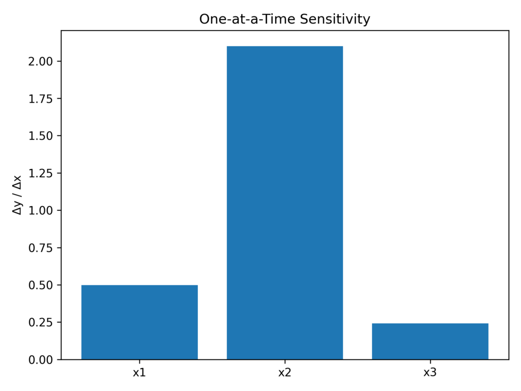
Sobol sensitivity analysis
Sobol analysis builds upon the previous method by quantifying not only the individual contribution of each variable to the output, but also evaluating how variables interact with one another.
The results of a Sobol analysis include:
S1 = first-order index: measures the direct contribution of each individual variable
ST = total-order index: captures all interaction effects involving a variable
S2 = second-order index: measures the combined contribution of variable pairs
A high S1 value indicates a strong connection with the output. Variables with high S1-ST values show significant interactions with other variables. Variables with low ST values can be considered negligible and removed from the model.
To build a Sobol sensitivity analysis, first define a data dictionary for your dataset. For each variable, specify either the extremes (minimum-maximum) or percentiles (5th-95th).
Next, pass this dictionary to the Saltelli method, which generates a matrix of simulated data.
Then, input this Saltelli matrix into your model to generate the output.
Finally, the Sobol analysis calculates the S1, ST, and S3 indices to evaluate how each variable impacts the outcome.
import numpy as np
from SALib.sample import saltelli
from SALib.analyze import sobol
import matplotlib.pyplot as plt

# 1. Definition of the clinical problem (variables and ranges)
problem = {
    'num_vars': 4,
    'names': ['age', 'creat', 'ef', 'nyha'],
    'bounds': [
        [50, 85],    # Age (years)
        [0.6, 2.5],  # Creatinine (mg/dL)
        [20, 70],    # Ejection Fraction EF (%)
        [1, 4]       # NYHA Class (I-IV)
    ]
}

# 2. Sample generation using Saltelli scheme
X = saltelli.sample(problem, 1024, calc_second_order=True)

# 3. Definition of simulated clinical model
def clinical_model(X):
    age = X[:, 0]
    creat = X[:, 1]
    ef = X[:, 2]
    nyha = X[:, 3]

    # logistic risk model (simplified)
    logit = 0.03 * age + 0.8 * creat - 0.05 * ef + 0.4 * nyha
    risk = 1 / (1 + np.exp(-logit))  # probability between 0 and 1
    return risk

# 4. Output calculation
Y = clinical_model(X)

# 5. Sobol sensitivity analysis
Si = sobol.analyze(problem, Y, calc_second_order=True, print_to_console=True)

# 6. Visualization (S1 and ST)
labels = problem['names']
S1 = Si['S1']
ST = Si['ST']

x = np.arange(len(labels))
width = 0.35

plt.bar(x - width/2, S1, width, label='First-order (S1)')
plt.bar(x + width/2, ST, width, label='Total-order (ST)')
plt.xticks(x, labels)
plt.ylabel('Sobol Index')
plt.title('Sobol Sensitivity Analysis (Clinical Model)')
plt.legend()
plt.grid(True)
plt.show()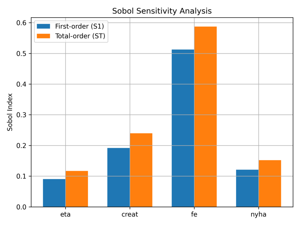
Fourier Amplitude Sensitivity Test (FAST)
The FAST analysis conducts sensitivity studies by transforming a multivariate function into a univariate function and analyzing its Fourier spectrum
Unlike Sobol analysis, FAST only analyzes variable importance—not interactions between variables—since it only provides the S1 parameter.
FAST works by converting complex input relationships into simpler wave patterns. Think of it like turning each input variable into a unique musical note. These notes are then played together in different combinations, while keeping their individual sounds distinct. By analyzing which notes appear strongest in the final output, we can identify which input variables have the biggest impact on the model’s results.
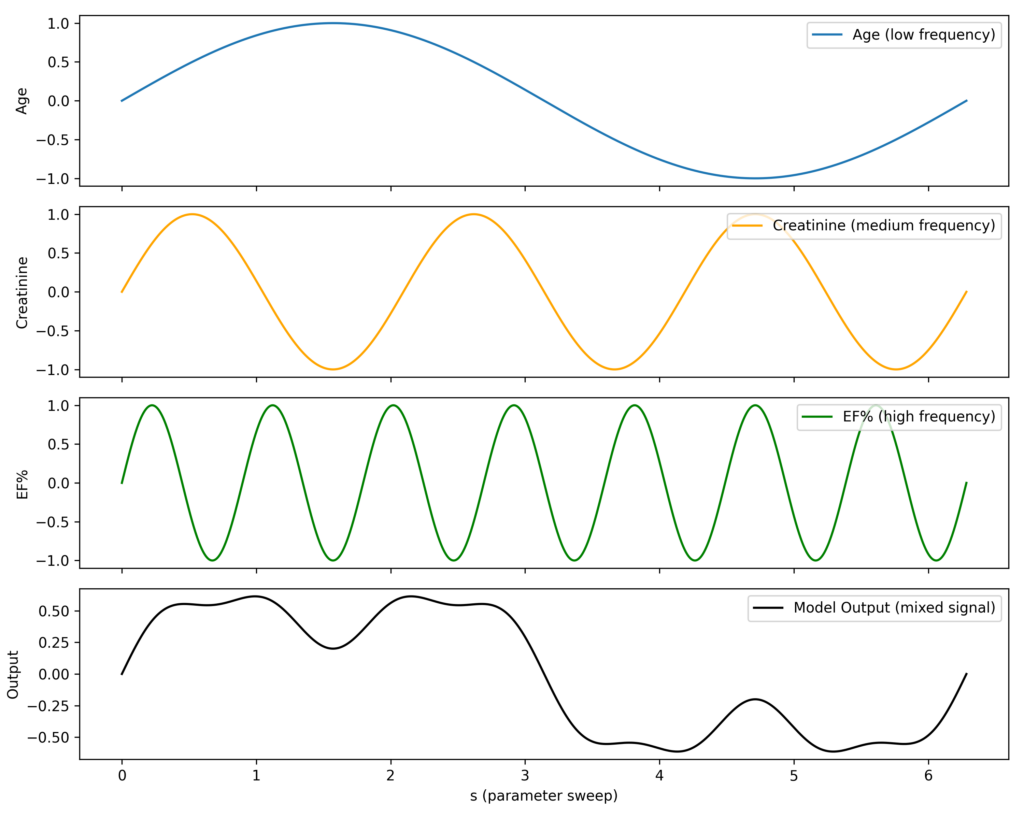
Example of FAST Analysis Implementation Using SALib:
import numpy as np
import matplotlib.pyplot as plt
from SALib.sample import fast_sampler
from SALib.analyze import fast

# 1. Define the problem with medical variables
problem = {
    'num_vars': 3,
    'names': ['age', 'creatinine', 'ejection_fraction'],
    'bounds': [
        [50, 85],       # Age in years
        [0.6, 2.5],     # Serum creatinine
        [20, 70]        # Left ventricular ejection fraction (%)
    ]
}

# 2. Define a simple clinical risk model (logit-based)
def clinical_model(X):
    age = X[:, 0]
    creat = X[:, 1]
    ef = X[:, 2]

    # Logistic-style linear combination
    logit = 0.04 * age + 0.8 * creat - 0.06 * ef
    risk = 1 / (1 + np.exp(-logit))  # mortality probability
    return risk

# 3. Generate samples using FAST
X = fast_sampler.sample(problem, 1000)

# 4. Evaluate the model
Y = clinical_model(X)

# 5. Perform FAST sensitivity analysis
Si = fast.analyze(problem, Y, print_to_console=True)

# 6. Plot the first-order sensitivity indices
plt.bar(problem['names'], Si['S1'])
plt.title('FAST Sensitivity Analysis (Clinical Model)')
plt.ylabel('First-order Index (S1)')
plt.grid(True)
plt.show()
Regression-based Sensitivity Analysis
This type of sensitivity analysis is commonly used in medicine and involves using standardized features in linear regression to examine their influence on the output.
Since the features are standardized, their coefficients can be directly compared to show each feature’s relative influence on the outcome.
However, this analysis has limitations—it cannot capture non-linear relationships or interactions between variables.
Example in Python:
import numpy as np
import pandas as pd
import matplotlib.pyplot as plt
from sklearn.linear_model import LinearRegression
from sklearn.preprocessing import StandardScaler

# 1. Generate synthetic input data
np.random.seed(0)
n = 1000
X = np.random.uniform(low=-np.pi, high=np.pi, size=(n, 3))
x1, x2, x3 = X[:, 0], X[:, 1], X[:, 2]

# 2. Define nonlinear model (Ishigami-like)
def model(x1, x2, x3, a=7, b=0.1):
    return np.sin(x1) + a * np.sin(x2)**2 + b * x3**4 * np.sin(x1)

Y = model(x1, x2, x3)

# 3. Standardize features for SRC
scaler = StandardScaler()
X_scaled = scaler.fit_transform(X)

# 4. Fit linear regression
reg = LinearRegression()
reg.fit(X_scaled, Y)

# 5. Get standardized regression coefficients
coef = reg.coef_
names = ['x1', 'x2', 'x3']

# 6. Plot
plt.bar(names, coef)
plt.title('Standardized Regression Coefficients (SRC)')
plt.ylabel('Sensitivity')
plt.grid(True)
plt.show()
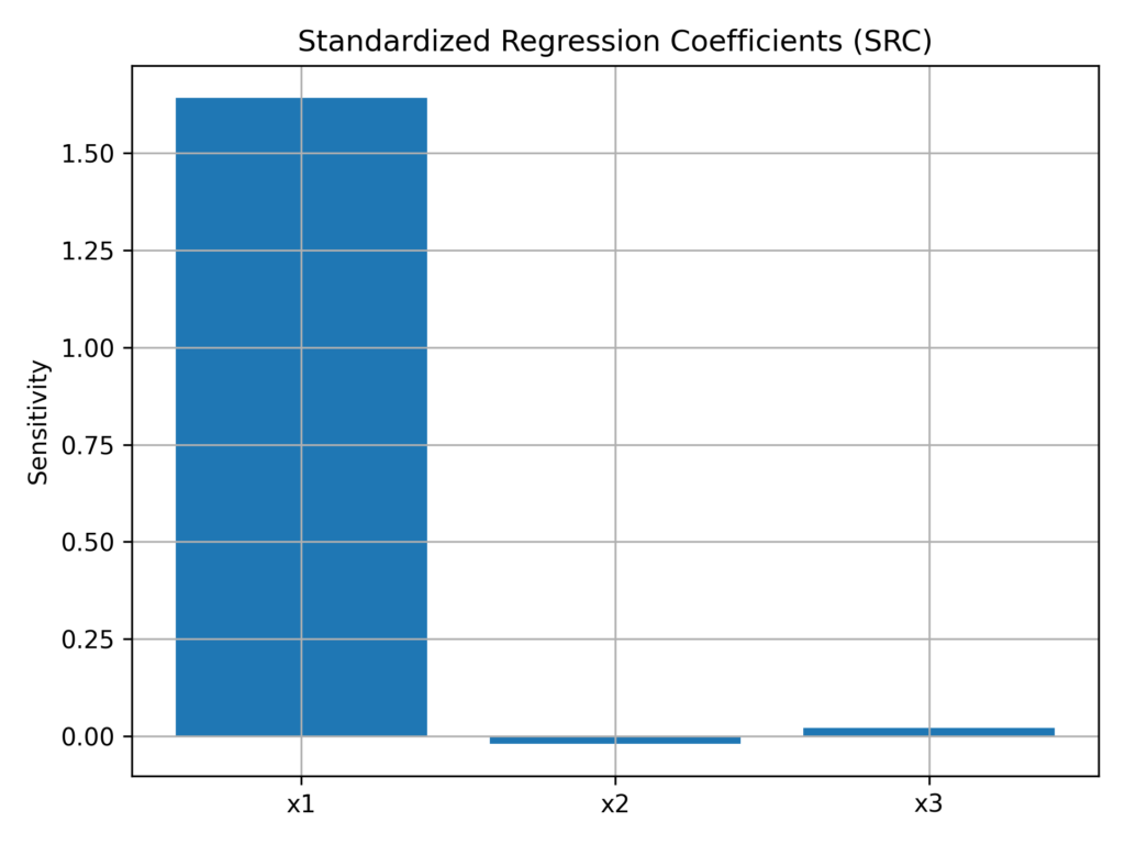
SHapley Additive exPlanations (SHAP)
SHAP is a sensitivity analysis technique that excels in Machine Learning by measuring how features affect output, even in black-box models.
It analyzes sensitivity at two levels: globally (examining how variables interact with the entire dataset) and locally (measuring how individual variables influence specific outcomes).
The SHAP framework automatically adapts to any model and generates visual results that clearly show both global and local variable impacts.
One of its key strengths is its ability to handle non-linear relationships.
The following Python example demonstrates how we create a synthetic medical dataset, train an XGBoost model with it, and analyze the model using SHAP to understand both global and local variable importance.
import numpy as np
import pandas as pd
import shap
import xgboost as xgb
import matplotlib.pyplot as plt
from sklearn.model_selection import train_test_split

# 1. Simulate clinical data
np.random.seed(42)
n = 1000
X = pd.DataFrame({
    'age': np.random.randint(50, 90, n),
    'creatinine': np.random.uniform(0.6, 2.5, n),
    'ejection_fraction': np.random.uniform(20, 70, n),
    'nyha_class': np.random.randint(1, 5, n)
})

# 2. Simulate a nonlinear outcome (mortality risk)
def simulate_risk(X):
    logit = (
        0.04 * X['age'] +
        0.9 * X['creatinine'] +
        0.5 * X['nyha_class'] -
        0.06 * X['ejection_fraction']
    )
    prob = 1 / (1 + np.exp(-logit))
    return (prob > 0.5).astype(int)  # binary outcome

y = simulate_risk(X)

# 3. Train/test split
X_train, X_test, y_train, y_test = train_test_split(X, y, test_size=0.2)

# 4. Train a gradient boosting model
model = xgb.XGBClassifier(use_label_encoder=False, eval_metric='logloss')
model.fit(X_train, y_train)

# 5. Compute SHAP values
explainer = shap.Explainer(model)
shap_values = explainer(X_test)

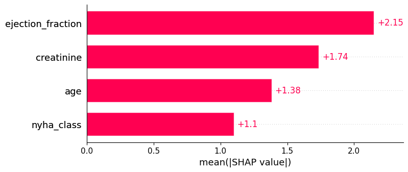
# 6. Global interpretation: bar plot
shap.plots.bar(shap_values, max_display=4)

# 7. Local explanation: waterfall for one patient
shap.plots.waterfall(shap_values[0])
SHAP Sensitivity Analysis Global Interpretation Graph
SHAP Sensitivity Analysis Local Interpretation Graph
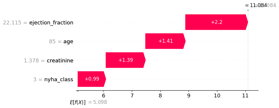
While the global interpretation graph is intuitive, the most valuable aspect of SHAP analysis lies in its local interpretation.
In the local interpretation, variables appear as color-coded arrows—red for positive effects on the outcome and blue for negative effects. Each arrow displays its corresponding “SHAP value,” representing that variable’s overall contribution to the final decision.
Random Forest Sensitivity Analysis
Many Machine Learning algorithms include built-in functions for measuring feature importance.
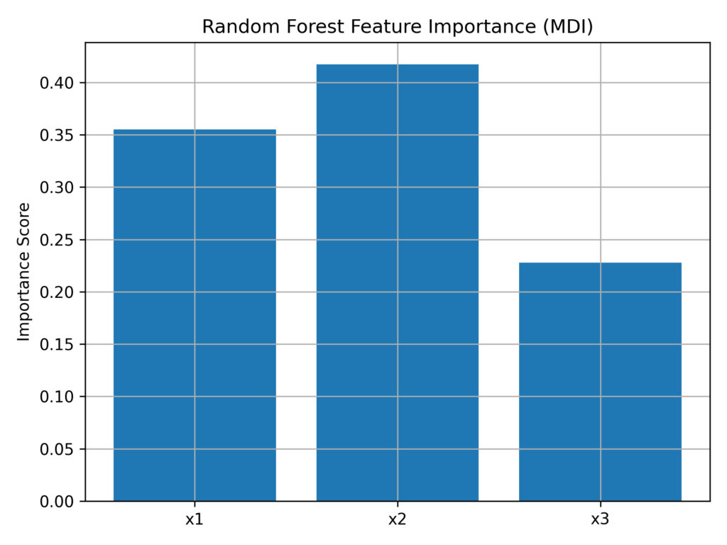
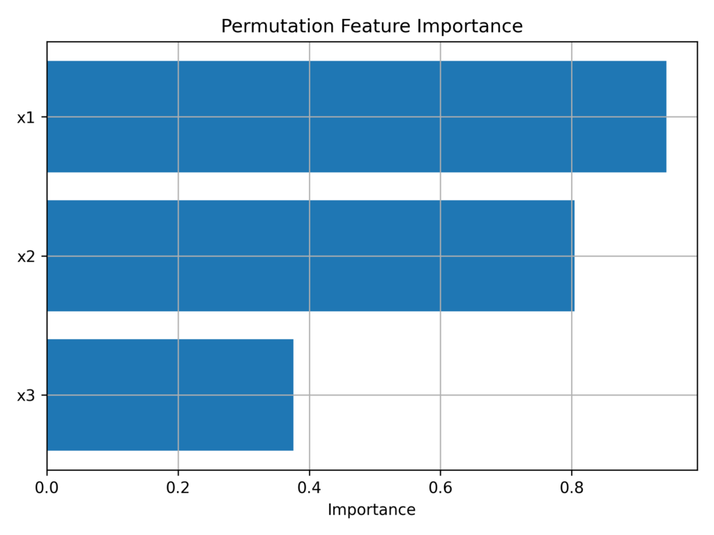
Random Forest algorithms, for instance, offer two distinct methods of measuring feature importance:
Mean Decrease Impurity (MDI), which evaluates how effectively a variable’s splits reduce impurity in the model
Permutation Importance, which calculates how much model performance drops when a feature’s values are randomly shuffled
Python Example: Analyzing Feature Importance:
import numpy as np
import pandas as pd
import matplotlib.pyplot as plt
from sklearn.ensemble import RandomForestRegressor
from sklearn.model_selection import train_test_split
from sklearn.inspection import permutation_importance

# 1. Generate synthetic data (same as before)
np.random.seed(0)
n = 1000
X = pd.DataFrame(np.random.uniform(-np.pi, np.pi, size=(n, 3)), columns=['x1', 'x2', 'x3'])

def model(X):
    a = 7
    b = 0.1
    x1, x2, x3 = X['x1'], X['x2'], X['x3']
    return np.sin(x1) + a * np.sin(x2)**2 + b * x3**4 * np.sin(x1)

y = model(X)

# 2. Train-test split
X_train, X_test, y_train, y_test = train_test_split(X, y, test_size=0.2)

# 3. Fit Random Forest
rf = RandomForestRegressor(n_estimators=100)
rf.fit(X_train, y_train)

# 4. Get mean decrease impurity feature importance
importances = rf.feature_importances_
features = X.columns

# 5. Plot
plt.bar(features, importances)
plt.title('Random Forest Feature Importance (MDI)')
plt.ylabel('Importance Score')
plt.grid(True)
plt.show()

# 6. Permutation importance (model-agnostic)
perm = permutation_importance(rf, X_test, y_test, n_repeats=10, random_state=0)
perm_sorted_idx = perm.importances_mean.argsort()

# 7. Plot permutation-based importance
plt.barh(features[perm_sorted_idx], perm.importances_mean[perm_sorted_idx])
plt.title('Permutation Feature Importance')
plt.xlabel('Importance')
plt.grid(True)
plt.show()
Tornado Plot Sensitivity Analysis
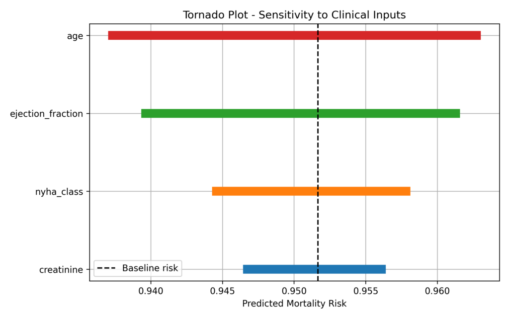
A Tornado Plot is a powerful tool for sensitivity analysis, widely used in medicine—especially for clinical decision analysis and risk modeling.
This visualization demonstrates how changing a single variable while holding others constant affects predictions, with variables ranked by their impact magnitude.
While effective, it provides only local analysis and may miss non-linear relationships in the data.
Now let’s examine how to create a tornado plot using simulated medical data:
import numpy as np
import pandas as pd
import matplotlib.pyplot as plt

# 1. Define a baseline clinical input set
baseline = {
    'age': 70,               # years
    'creatinine': 1.2,       # mg/dL
    'ejection_fraction': 40, # %
    'nyha_class': 3          # NYHA I-IV
}

# 2. Define a simple logistic-style clinical model
def predict_risk(inputs):
    logit = (
        0.04 * inputs['age'] +
        0.9 * inputs['creatinine'] +
        0.5 * inputs['nyha_class'] -
        0.06 * inputs['ejection_fraction']
    )
    prob = 1 / (1 + np.exp(-logit))
    return prob

# 3. Define ±10% variation for deterministic sensitivity
delta = 0.1
results = []

for var in baseline:
    low = baseline.copy()
    high = baseline.copy()

    # Apply ±10% variation
    low[var] *= (1 - delta)
    high[var] *= (1 + delta)

    y_low = predict_risk(low)
    y_high = predict_risk(high)

    results.append({
        'Variable': var,
        'Low': y_low,
        'High': y_high,
        'Range': abs(y_high - y_low)
    })

# 4. Create DataFrame and sort
df = pd.DataFrame(results).sort_values(by='Range', ascending=True)

# 5. Plot tornado chart
fig, ax = plt.subplots(figsize=(8, 5))
for i, row in df.iterrows():
    ax.plot([row['Low'], row['High']], [row['Variable'], row['Variable']], lw=10, solid_capstyle='butt')
baseline_risk = predict_risk(baseline)
ax.axvline(baseline_risk, color='k', linestyle='--', label='Baseline risk')
ax.set_title("Tornado Plot - Sensitivity to Clinical Inputs")
ax.set_xlabel("Predicted Mortality Risk")
ax.legend()
ax.grid(True)
plt.tight_layout()
plt.show()
Bayesian Sensitivity Analysis with PyMC
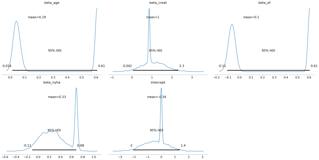
Unlike traditional models that assess feature importance through direct modification and outcome evaluation, the Bayesian method takes a distinct approach.
It treats inputs as probability distributions, which allows it to track uncertainty throughout the analysis and measure sensitivity based on posterior distributions.
While this approach is computationally intensive, it works particularly well with small datasets and provides full probability distributions instead of simple point estimates.
In Python, this analysis can be performed using the PyMC and ArviZ libraries
import pymc as pm
import arviz as az
import numpy as np
import matplotlib.pyplot as plt

# 1. Simulate synthetic clinical data (100 patients)
np.random.seed(42)
n = 100
age = np.random.normal(70, 10, n)
creatinine = np.random.normal(1.2, 0.3, n)
ejection_fraction = np.random.normal(45, 10, n)
nyha_class = np.random.randint(1, 5, n)

# Generate binary outcome (mortality) based on a latent logistic model
logit = (
    0.04 * age +
    0.9 * creatinine +
    0.5 * nyha_class -
    0.06 * ejection_fraction
)
prob = 1 / (1 + np.exp(-logit))
mortality = np.random.binomial(1, prob)

# 2. Fit Bayesian logistic regression with PyMC
with pm.Model() as model:
    # Priors
    beta_age = pm.Normal('beta_age', mu=0, sigma=1)
    beta_creat = pm.Normal('beta_creat', mu=0, sigma=1)
    beta_ef = pm.Normal('beta_ef', mu=0, sigma=1)
    beta_nyha = pm.Normal('beta_nyha', mu=0, sigma=1)
    intercept = pm.Normal('intercept', mu=0, sigma=1)

    # Linear model
    logit_p = (intercept +
               beta_age * age +
               beta_creat * creatinine +
               beta_ef * ejection_fraction +
               beta_nyha * nyha_class)

    # Likelihood
    p = pm.Deterministic('p', pm.math.sigmoid(logit_p))
    y_obs = pm.Bernoulli('y_obs', p=p, observed=mortality)

    # Sampling
    trace = pm.sample(1000, tune=1000, target_accept=0.95, return_inferencedata=True)

# 3. Plot posterior distributions
az.plot_posterior(trace, var_names=['beta_age', 'beta_creat', 'beta_ef', 'beta_nyha', 'intercept'], hdi_prob=0.95)
plt.tight_layout()
plt.show()
Design of Experiments (DoE) and ANOVA Sensitivity Analysis
Design of Experiments (DoE) is a statistical methodology for planning and structuring experiments, whether physical or simulated.
In a typical scenario, variables that influence risk are tested at their minimum and maximum values to measure their impact on outcomes.
This testing can be conducted through several approaches:
Full factorial: examines all possible combinations
Fractional factorial: analyzes a strategic subset of combinations
Plackett-Burman: identifies and prioritizes the most influential variables
Central composite: specifically designed for non-linear models
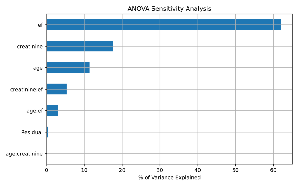
Once the DoE-based testing is complete, ANOVA quantifies each variable’s influence on the output.
In summary, DoE structures the experimental design by identifying relevant test variables, while ANOVA measures how these variables contribute to output variation.
In the following Python example, we’ll execute the design manually for simplicity:
import numpy as np
import pandas as pd
import statsmodels.api as sm
from statsmodels.formula.api import ols
import matplotlib.pyplot as plt

# 1. Manually create a 2-level full factorial design (3 variables → 8 combinations)
design = np.array([
    [-1, -1, -1],
    [-1, -1,  1],
    [-1,  1, -1],
    [-1,  1,  1],
    [ 1, -1, -1],
    [ 1, -1,  1],
    [ 1,  1, -1],
    [ 1,  1,  1]
])
design_df = pd.DataFrame(design, columns=['age', 'creatinine', 'ef'])

# 2. Rescale to realistic clinical values
design_df['age'] = (design_df['age'] + 1) * (85 - 50)/2 + 50
design_df['creatinine'] = (design_df['creatinine'] + 1) * (2.5 - 0.6)/2 + 0.6
design_df['ef'] = (design_df['ef'] + 1) * (70 - 20)/2 + 20

# 3. Simulate model output (mortality risk)
def clinical_model(row):
    logit = 0.04 * row['age'] + 0.9 * row['creatinine'] - 0.06 * row['ef']
    prob = 1 / (1 + np.exp(-logit))
    return prob

design_df['mortality'] = design_df.apply(clinical_model, axis=1)

# 4. Fit linear model with interactions
formula = 'mortality ~ age + creatinine + ef + age:creatinine + age:ef + creatinine:ef'
model = ols(formula, data=design_df).fit()

# 5. Perform ANOVA
anova_table = sm.stats.anova_lm(model, typ=2)
anova_table['Percent'] = 100 * anova_table['sum_sq'] / anova_table['sum_sq'].sum()

# 6. Plot percentage of variance explained
anova_table = anova_table.sort_values(by='Percent', ascending=True)
anova_table['Percent'].plot(kind='barh', figsize=(8,5))
plt.xlabel('% of Variance Explained')
plt.title('ANOVA Sensitivity Analysis (Manual Design)')
plt.grid(True)
plt.tight_layout()
plt.show()
Summary of Sensitivity Analysis Technique
| Method | Type | Global ? | Interaction? | Model-Agnostic | Key Strength | Main Limitation |
|---|---|---|---|---|---|---|
| One-at-a-Time (OAT) | Determin. | No | No | Yes | Simple and fast | Misses interactions and non inearities |
| Sobol’ Analysis | Variance-based | Yes | Yes | Yes | Full variance decomposition | Computationally intensive |
| FAST | Spectral | Yes | No | Yes | Efficient for main effects | Can’t capture interactions (unless eFAST) |
| Regression-based (SRC, PCC) | Statistical | Partial | No | Yes | Easy to interpret | Assumes linear relationships |
| SHAP Values | Additive ML | Yes | Yes | Yes | Local + global interpretability | Computationally heavy on large models |
| Random Forest Feature Importance | Tree-based ML | Yes | Partial | Partial | Built-in in tree models | Can be biased or misleading |
| Tornado Plot | Visual Determin. | No | No | Yes | Great for presentations and audits | Lacks statistical rigor |
| Bayesian Sensitivity (PyMC, Prob. Mod.) | Probabilistic | Yes | Yes | Yes | Accounts for uncertainty in inputs | Requires full probabilistic modeling |
| DoE + ANOVA | Statistical Design | Yes | Yes | Yes | Captures interaction effects explicitly | Requires structured input levels |
| Monte Carlo + Correlation | Sampling-based | Yes | No | Yes | Easy to implement | Only captures monotonic trends |
Conclusion
Sensitivity analysis is an essential tool for the evaluation and interpretation of clinical predictive models. It not only improves accuracy but also helps understand their internal structure and behavior for input variable uncertainty. Specifically, it allows:
- Identifying which variables have the greatest influence on an outcome (e.g., post-operative mortality)
- Quantifying the relative importance and interactive or synergistic relationships between clinical factors
- Supporting the development of transparent models that are explainable and clinically justifiable
- Improving robustness and confidence in model-based decision-making